

Isn’t the new Aston Villa jersey by Adidas something of real beauty? The claret and blue has always been iconic, but Adidas have absolutely nailed the balance this season. There’s something about the way the claret and blue sits on this year’s home shirt — clean, sharp and classy. It’s class without trying to be something else. But as much as I love the home kit, it’s the away jersey that’s done it for me.
That black away jersey? Simply outstanding. Ten out of ten. It’s sleek, stylish, and beautifully moody. The kind of shirt that even a neutral football fan would admire — not that they’d go out and buy it, of course — but the appeal is there. It gives off that casual, streetwear vibe without losing the club’s identity. It’s rare for a football jersey to tick both boxes: wearable fashion and proper a football shirt.
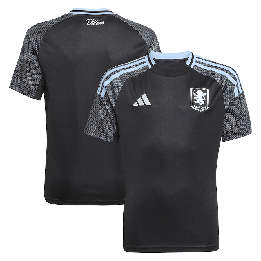
Just one thing, I’d love to see Adidas release a limited edition version with the old-school Trefoil logo (Image below). Just imagine that — the classic 70’s Adidas logo on that stunning black away jersey, it’d elevate it into something truly legendary. Still, even without the Trefoil logo, Adidas have delivered. UTV
Sorry I disagree it’s black it’s boring it’s got no identity. Its like 11 refs running around.so not our club at all this is one shirt I won’t be buying. Last years kit was by far the best kit we’ve had for years
🤣😂😆😂🤣😆😆